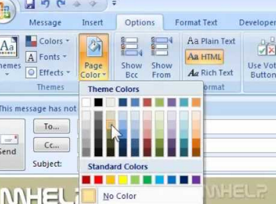
 Imagine this scenario: You’ve crafted a strong email message to your employees. You’ve ensured that all the pertinent details have been included and reviewed the message for tone, organization, spelling, and grammar… and now you’re ready to consider the finishing touches.
Question: to add a spot of color? Or not?
Like kids with a brand new coloring book, it can be tempting to add color to an email. After all, why would Microsoft or Google offer the ability to change font colors if it wasn’t a good idea?
Is a good idea to use color in your emails? And if so, when?
Email Purpose
First, let’s differentiate between emails for marketing purposes and business communications-focused emails.
Marketing emails fall into the category of promotions, and while you might be “motivating” or “persuading” your reader to act in both instances (ie: “Buy Now!” or “Please approve this request for vacation time”), the situation, tone, and context are different.
In this case, I’m referring to the more utilitarian function of business communications: Using email to communicate outside of the marketing realm with your organization’s stakeholders such as employees, customers, vendors, etc.
Don’t read “utilitarian” to mean that you don’t spend time on the quality, clarity, readability, and even visual appeal of your business message, though. Nor does it mean that there isn’t a place for more high-production value communications (think annual reports, employee benefits materials, etc).
I’m referencing the bulk of business email communication. The average office worker receives 92 emails and sends 32 emails daily. In short, your employees, coworkers and colleagues are overwhelmed with information.
My Recommendation
While it’s tempting to use color to help “cut through the clutter” and try using color to create engagement, my suggestion is to keep the text black.
Too much colored text and highlighting can distract the reader from the purpose of your message. Consider other ways to emphasize or organize your content through paragraphs, bullets, and occasional underlining, bolding or italicizing.
A Place for Color
However, that’s not to say there isn’t a place for color in your email communications. Here are some examples.
- Graphics. It’s true that a picture is worth a thousand words… if it’s the right picture that conveys your message. For example, using a pie chart to illustrate customer data is far easier to read when it’s in color (rather than grey-scale). Bonus Tip: With 8% of the population being color vision deficient or “color blind,” be cautious with your color combination selections, and consider adding pattern and textures to enhance visual differentiation.
- Deadlines. If you need a response from someone by a specific date, sometimes highlighting the date can help reinforce the urgency for immediate action.
- Hyperlinking. Most word processing programs will delineate hyperlinked text with blue font and underlining. In this case, leaving the text a different color allows the reader to immediately identify you are pointing out additional resources about the email topic.
Bottom line: Stick with black font for the majority of your email. When you do opt to include color, pick your colors carefully. Use them sparingly and purposefully.
Want to learn more about communicating more effectively through email? Check out our books (Amazon) and courses.
about any of our products or services.
 Visit us
San Francisco Bay Area
 Mail us
natasha@adcomdesigns.com
 Call us
(510) 655-6477

